Hi,
Firstly, can you give some more detail on what exactly you are comparing. I don’t know what the data source for the data from the other provider is and am unsure what sensor you are using in Sentinel Hub services. This lack of detail maybe due to the resolution or the color ramp that you are using.
However, without some more information, I can only speculate
Hello,
Thank you for the quick response.
Our colleague says that this is the request they make on the sentinel hub.
https://services.sentinel-hub.com/ogc/wfs/be9c8b11-25c8-MASKED?SERVICE=WFS&VERSION=1.3.0&request=GetFeature&typenames=DSS2&CRS=EPSG%3A4326&BBOX=${bbox}&outputformat=application/json&time=${yyyymm}/${yyyymm}
https://services.sentinel-hub.com/ogc/wms/be9c8b11-MASKED
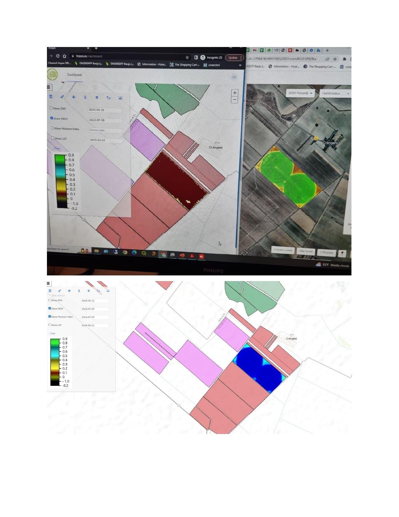
Also, it is strange to us that in the Moisture index image (from Sentinel) you can clearly see the print of the pivonts, but not in the NDVI image.
Please help us understand this discrepancy.
As I said previously, you haven’t provided enough information for us to help troubleshoot this issue.
We need to know:
- The request parameters; the sensor used, request resolution, time&date, area of interest. If you can share the curl request that would be ideal.
- More details about how you are visualising the data, it is impossible to compare the two products if they are using different colour ramps. Comparing the pixel values is a much more effective method.
Hi Oana,
You are using a default visualization in your Sentinel Hub request, which may not be adapted to your specific use-case. If you go to your dashboard and look at the NDVI
layer, you will see that it uses the following Evalscript:
//VERSION=3
let viz = ColorMapVisualizer.createDefaultColorMap();
function evaluatePixel(samples) {
let val = index(samples.B08, samples.B04);
val = viz.process(val);
val.push(samples.dataMask);
return val;
}
function setup() {
return {
input: [{
bands: [
"B04",
"B08",
"dataMask"
]
}],
output: {
bands: 4
}
}
}
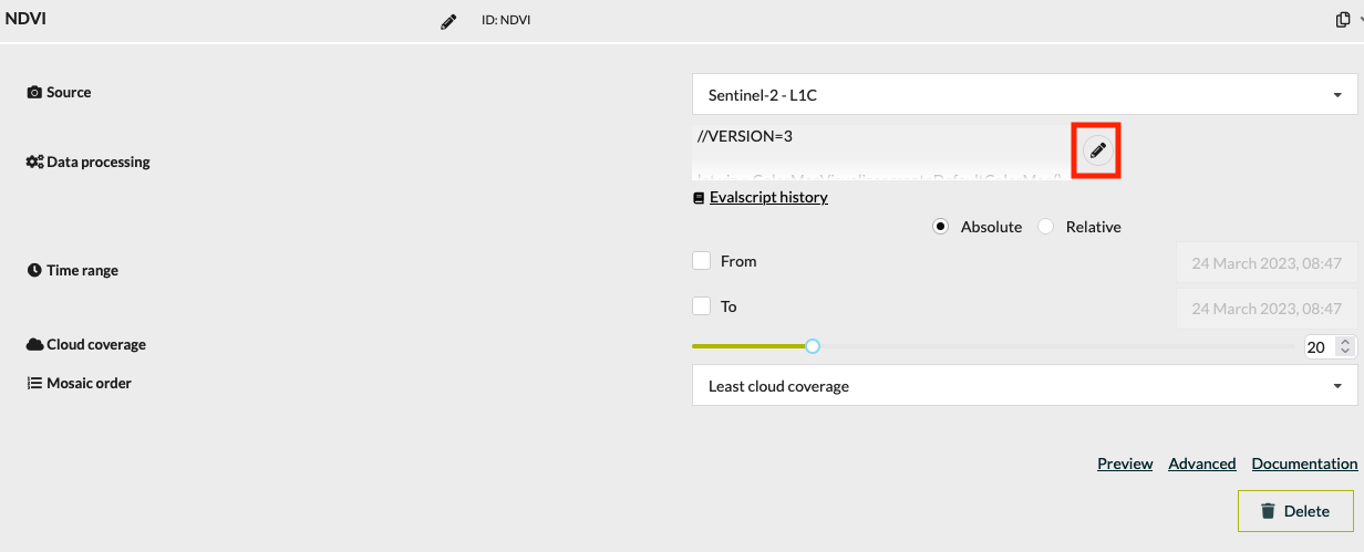
You have control over the way the NDVI data is displayed, and can modify the Evalscript for this particular layer in the dashboard (or create a new layer). If you edit the layer in your configuration:
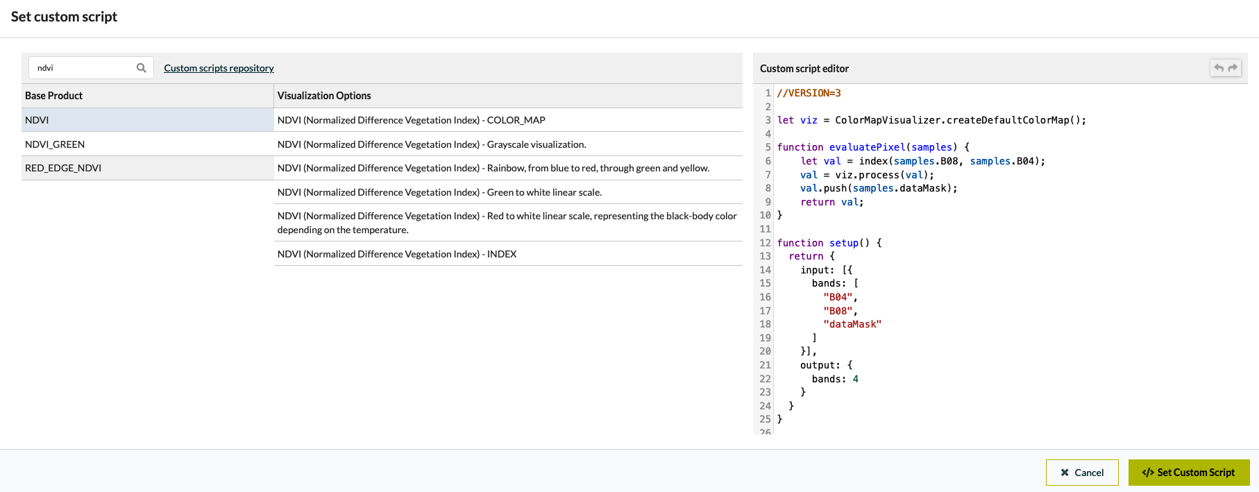
You can select different pre-selected visualizations by searching for NDVI
:
It may also be worth modifying the Evalscript to set the limits (min, max) values for display. You can do this either through the default visualisers or define levels yourself (see examples).
Hello,
The info you send us regards a custom script.
We are not making custom script. We are using your API. If I understand correctly you are suggesting to change colors in our dashboard from Sentinel Hub. Can you give us a video tutorial for this?
Thank you.
Yes, absolutely: custom scripts control the way data is returned through our services. Although the dashboard interface has been updated since, this video tutorial should provide you will all the information needed.
If you run into problems, don’t hesitate to ask here!
This topic was automatically closed 60 days after the last reply. New replies are no longer allowed.