

I downloaded 8-band analytics ready surface reflectance PlanetScope scenes for a study. I want to create a visualization of one of the scenes with QGIS. However, when I load the scene in QGIS as a raster, it doesn’t look like the agricultural field I’m expecting. I made sure to assign the bands as red = 6, blue = 2, and green = 4.
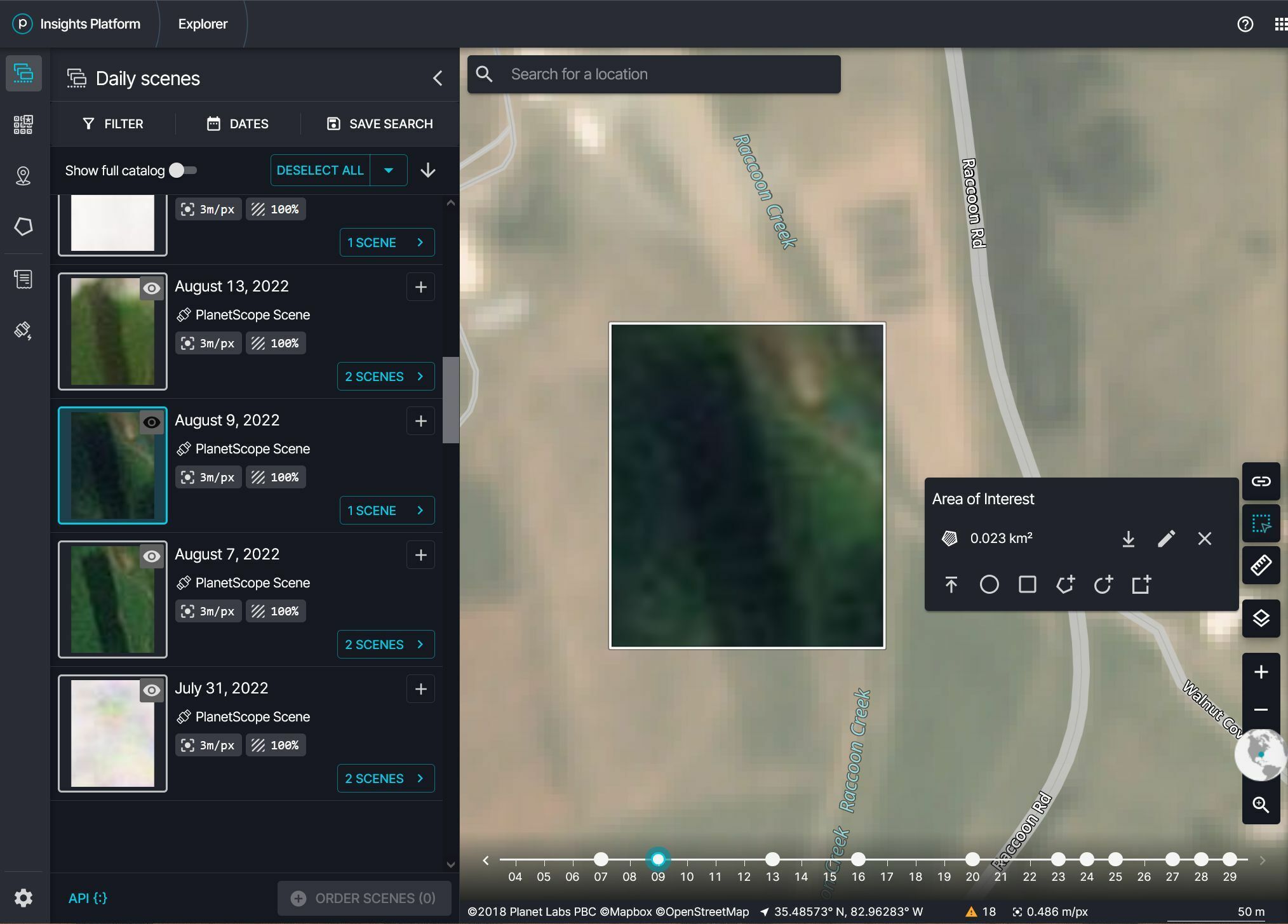
This is how the scene looks in Planet Explorer
This is how the PlanetScope scene looks rendered in QGIS
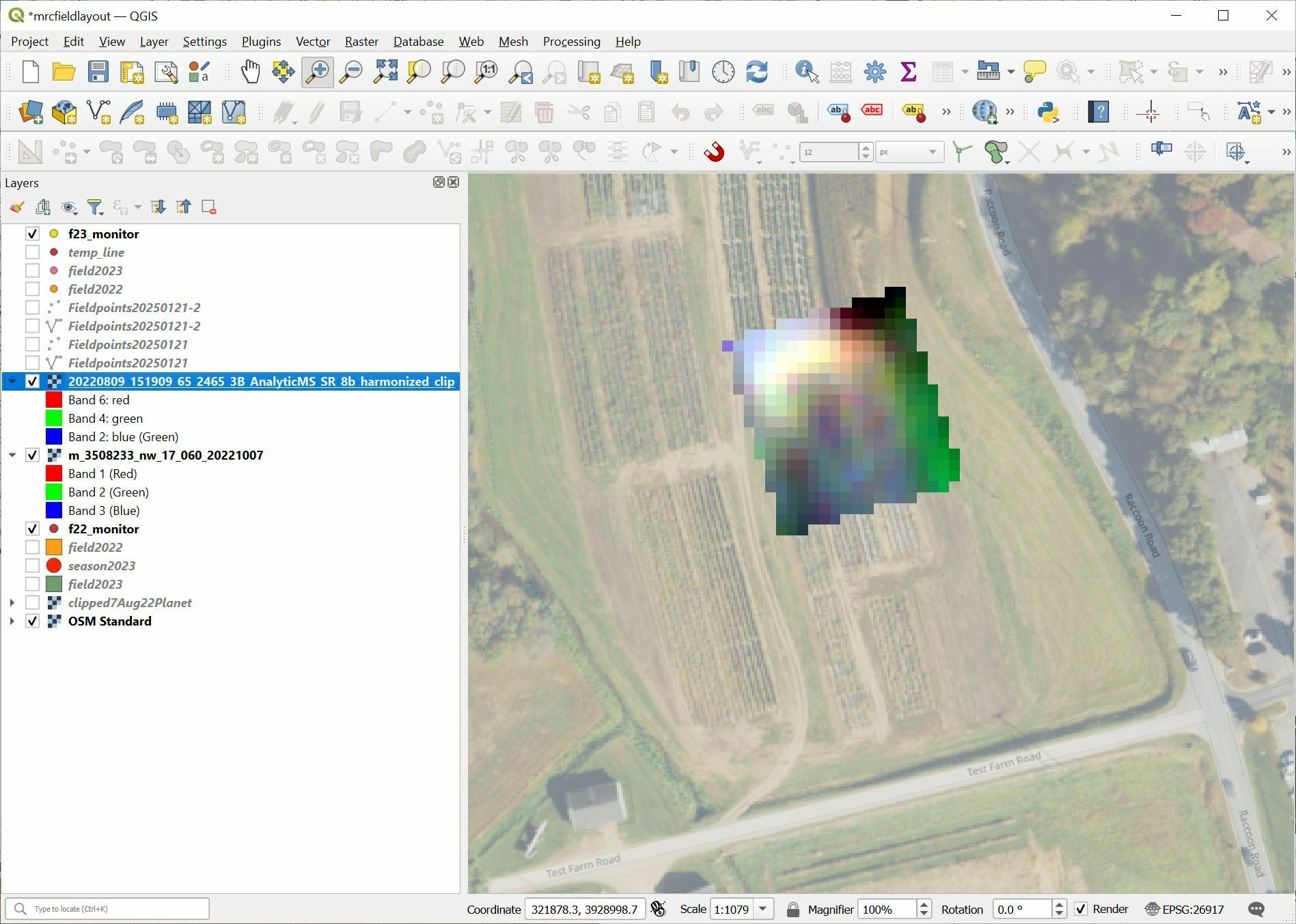
The scene looks like an odd mosaic of colors. I realize that the resolution of the underlying NAIP image might influence how the scene might be perceived, but honestly, the scene looks like an odd mosaic of colors. How can I get the scene to render in QGIS the way it looks in Explorer?