I would like to know how to balance the mosaic images. I would like to do a classification but it seems like some images have the red value as twice of the other images, even those from the same day. Is there a color balancing I can do?
Hi
Tree Bloom Change Detection is an exercise on Planet University that has classification as part of it, perhaps you can apply the steps in this exercise to your own work?
Hi All,
Just chiming in here that I’m encountering a similar problem, and the the Tree Bloom Change Detection doesn’t really deal with the issue. It would be good to have some clarification on how images are mosaiced in Planet Explorer - this is a really convenient option to have, but it doesn’t seem to work all that well.
I’ve downloaded a number of mosaics using Planet Explorer - my study site is larger than an individual scene, so I opt to have the output provided as a single tiff that is a mosaic of multiple scenes clipped to my AOI. Importantly, I do not select the harmonize to sentinel option, as I think this exacerbates the problem.
The resulting images still have seems where the individual overlapping scenes were mosaiced together. I’m guessing that this is due to some sort of differences between sensor and/or lack of or need for sensor cross-calibration?
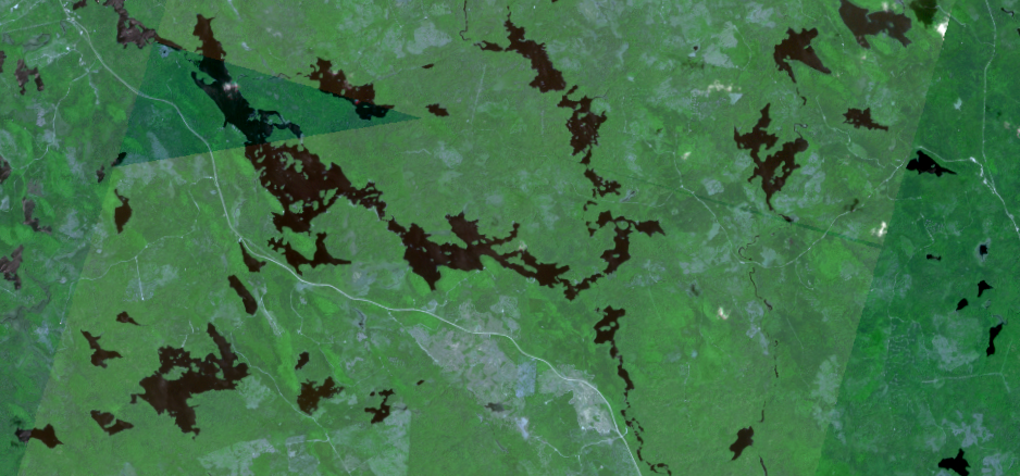
Below are a couple of images, these are of vegetation indices calculated for multiple bands, but the issue is apparent in all bands.
The difference seems subtle in these images, but it makes a difference when, for example, you want to analyze spatial or temporal patterns of these veg indices. In this case the differences related to this issue are of the same order of magnitude as ecological differences, making the analyses really tricky.
Is the solution here to download the individual overlapping scenes and mosaic them myself? I really like the convenience of doing this in Planet Explorer, but it doesn’t seem to be working well. Additionally downloading individual scenes includes more data against my monthly quota. Any insights folks might have would be most appreciated.
Hello everyone,
While PlanetScope Basemaps enable timely and convenient visualization, we have a new product Analysis-Ready PS that is optimized for temporal analysis that takes the past into account and ensures accurate measurements for changes over a long period within an area of interest.
Learn more about ARPS here, or explore open-source Analysis-Ready PlanetScope data in Planet’s Sandbox Data collections.
Thanks Karla. To clarify, the images I refer to above are the Analysis Ready data.
The “composite” tool in the Orders API (and available through the Explorer imagery ordering UI above) does last-on-top compositing, and doesn’t apply any other adjustments to the images. The Basemaps product (this is different from the composite tool shown above) handles this mosaicing, balancing, and seamline removal.
The OP doesn’t state what date that example is pulled from, but it may be that this is showing images taken from different generations of satellites on the same day. The Dove Classics had different spectral bands from the newer Dove-R or SuperDove satellites, which makes direct comparisons more difficult.
Using scenes directly, I would suggest using the Harmonize tool to make the images more comparable to each other (although I see you say that you’ve had poor results with that,
Enter your E-mail address. We'll send you an e-mail with instructions to reset your password.