

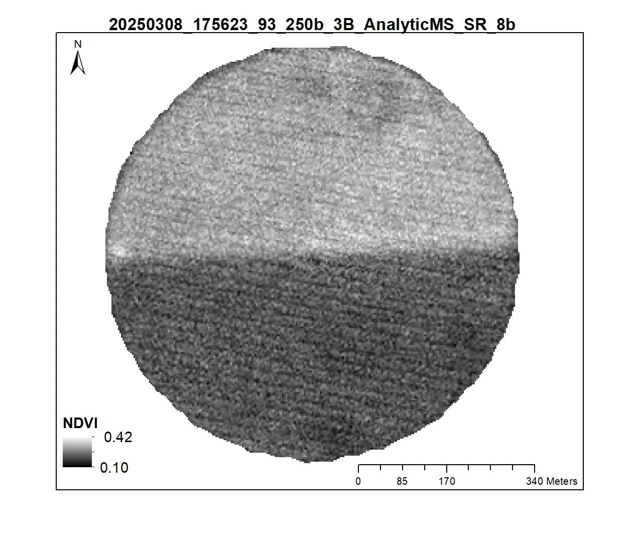
Hello, I’ve been working with Dove and Super Dove time series to explore in-season variable rate nitrogen adjustments with private sector stakeholders, where NDVI and other indices are key metrics to characterize in-field variability. In some of the scenes (such as the one shared above) I’ve noticed a visual striping pattern, and I am wondering if there is a way to adjust for this, or to know which satellites may be prone to this to avoid them in our analyses. We will eventually be using imagery over large areas and won’t be able to evaluate each scene visually, so an automated way to 1) adjust for the striping, or 2) know which scenes have them to remove from our time series would be quite valuable. Thank you!
- Jyoti Jennewein, USDA-ARS